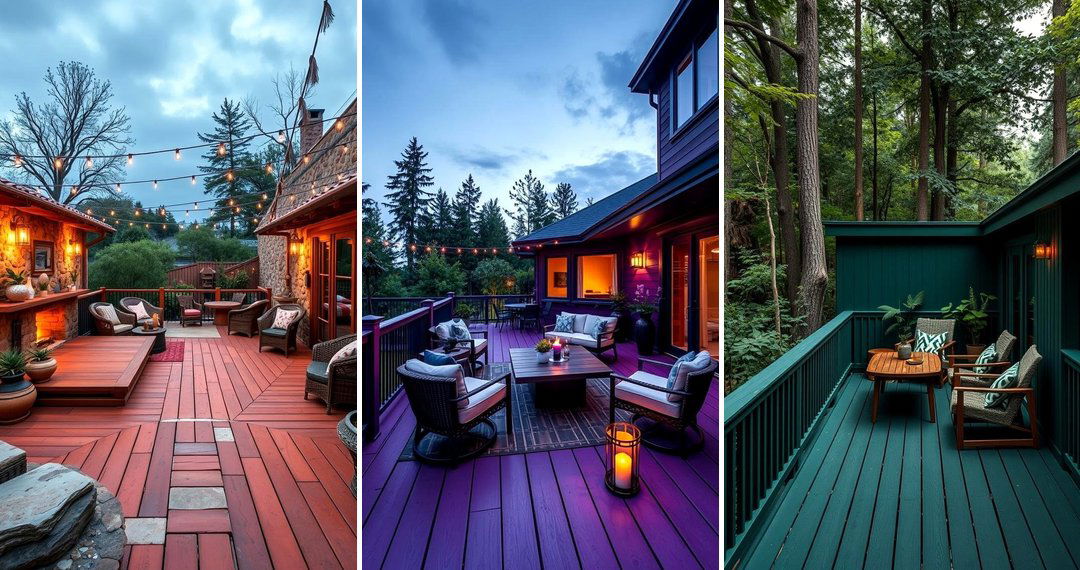
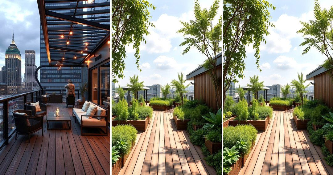
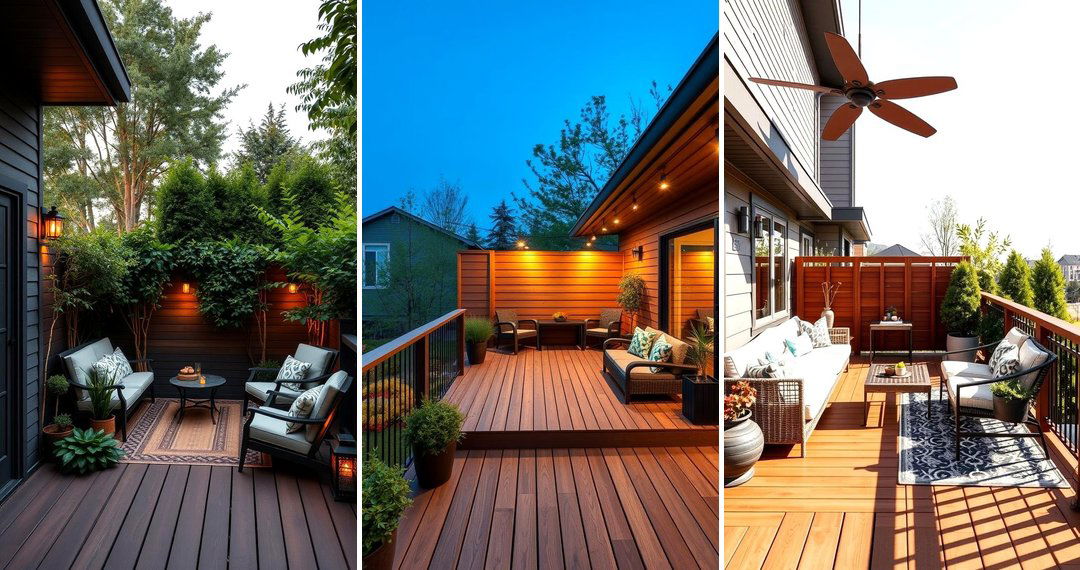
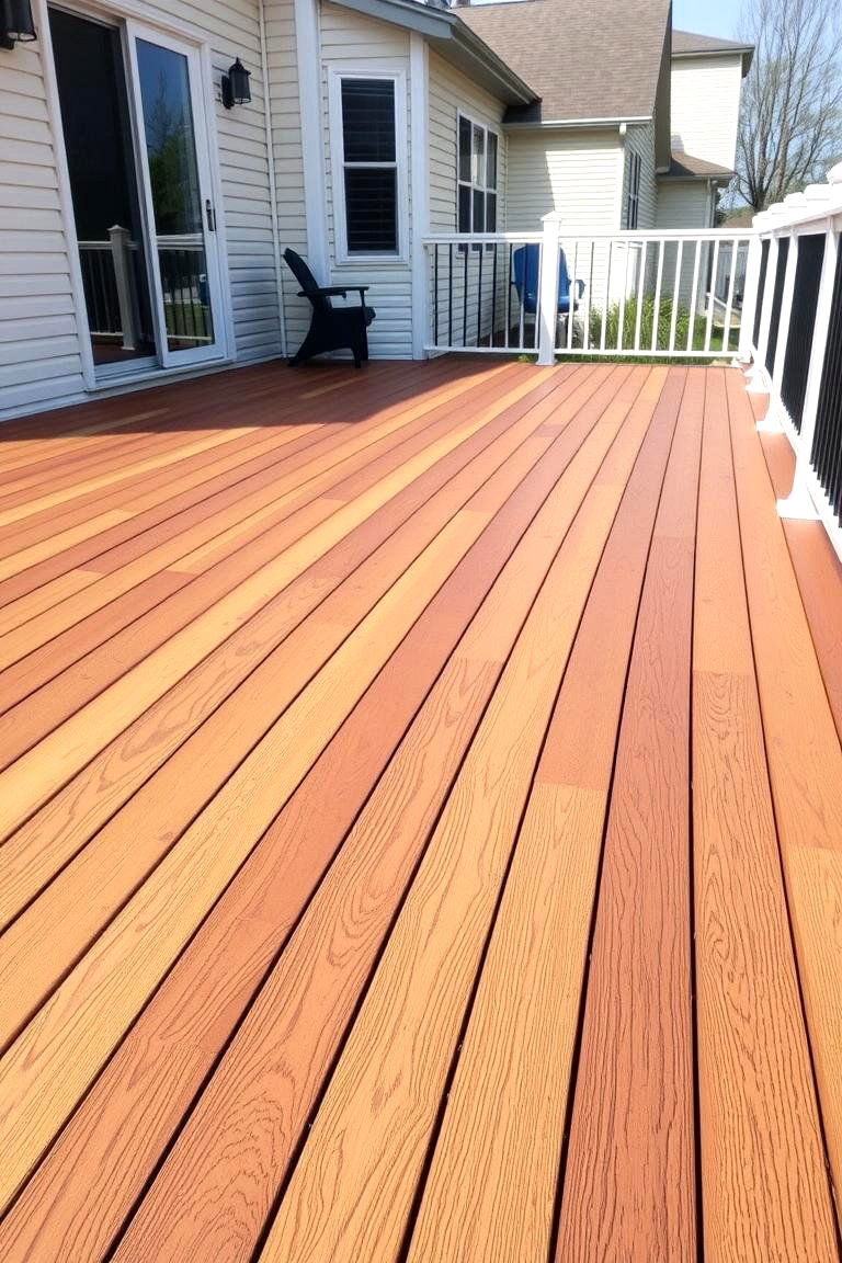
Welcome to the world of deck design, where even a subtle shift in color can dramatically enhance your outdoor living space. Two-tone deck color schemes offer a fantastic way to add personality, define areas, and create visual interest, transforming your deck from a simple platform into a stylish extension of your home. Understanding how to leverage different shades and hues can unlock a wealth of design possibilities, allowing you to tailor your deck to your unique tastes and the surrounding environment. Let's explore the exciting realm of 24 Two Tone Deck Color Schemes and discover how these combinations can elevate your outdoor aesthetic.
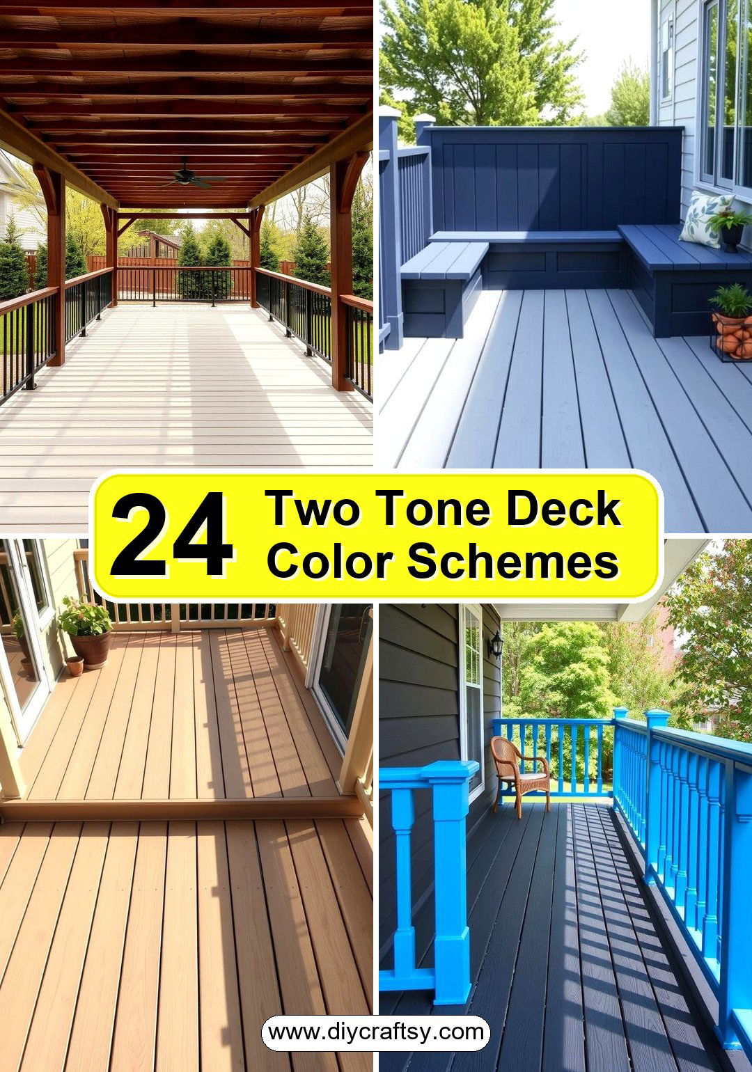
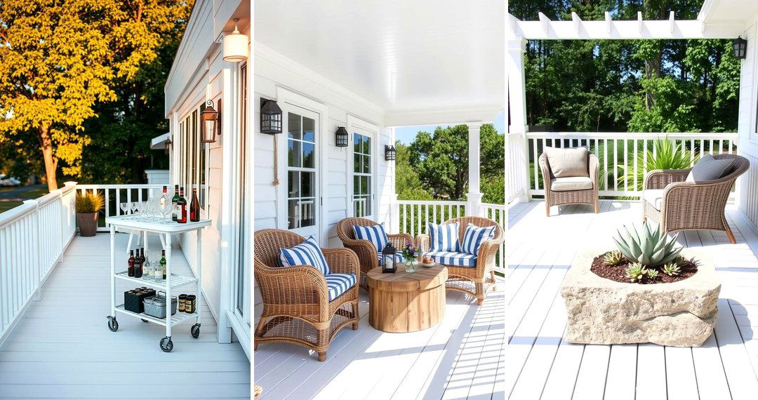
1. Contrasting Perimeter for Definition
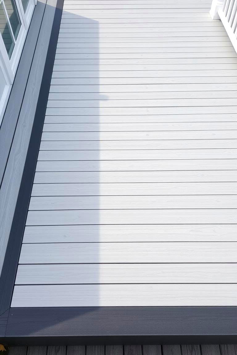
Consider outlining your deck with a darker or lighter shade than the main decking boards. This approach clearly defines the edges of your outdoor space, creating a polished and intentional look. The contrast can also enhance safety by visually indicating the boundaries of the deck. For instance, a light grey deck with a dark charcoal perimeter provides a modern and sophisticated feel, while a warm brown deck with a crisp white border offers a more traditional and charming aesthetic. This simple yet effective technique adds depth and visual appeal to any deck size or style.
2. Highlighted Stair Risers for Safety and Style
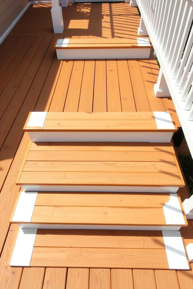
Another excellent idea is to paint or stain the stair risers in a contrasting color to the treads. This not only adds a stylish touch but also significantly improves safety by making the steps more visible. Imagine a natural wood-toned deck with bright white risers, creating a clean and nautical vibe. Alternatively, darker risers on a lighter deck can add a touch of drama and sophistication. This subtle detail can transform a functional element into a design feature, enhancing both the beauty and practicality of your deck.
3. Zoned Areas with Different Colors
With a two-tone approach, you can effectively create distinct zones on your deck. For example, designate a dining area with one color and a lounge space with another. This visual separation helps to organize the deck and makes it feel more intentional and functional. Perhaps a lighter, airy color for the lounging area and a richer, warmer tone for the dining space could define these zones beautifully. This technique is particularly useful for larger decks, helping to break up the space and create more intimate settings.
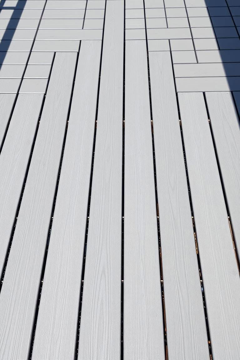
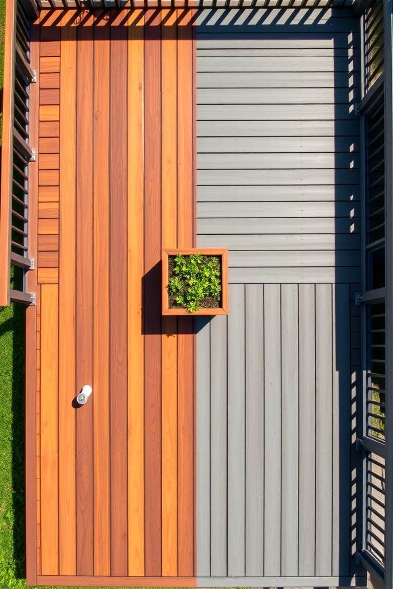
4. Vertical vs. Horizontal Board Color Variation
Take advantage of the direction of your decking boards to create a unique two-tone effect. For instance, if the main deck boards are laid horizontally, consider using a contrasting color for a section laid vertically, or vice versa. This unexpected change in direction, coupled with a color shift, can add significant visual interest and create a focal point. Imagine a deck with light brown horizontal boards and a section of darker brown vertical boards forming a subtle pattern. This technique adds a contemporary and artistic flair to your outdoor space.
5. Light Main Deck with Dark Accent Boards
The classic combination of a light main deck color with darker accent boards offers a timeless and versatile look. This scheme can be achieved by using darker boards as a border, as in our first point, or by incorporating them into a pattern within the main deck area. For example, you could have a light grey deck with a few strategically placed dark grey boards creating a subtle stripe or geometric design. This approach provides a sophisticated contrast without being overly bold.
6. Dark Main Deck with Light Accent Boards
Conversely, a dark main deck with lighter accent boards can create a dramatic and modern statement. This scheme works particularly well in brighter outdoor settings, where the contrast will be most noticeable. Think of a deep brown deck punctuated by a few light beige boards arranged in an interesting pattern or used to highlight specific architectural features. This combination exudes elegance and can make your deck feel like a luxurious outdoor retreat.
7. Natural Wood Tones with Painted Accents
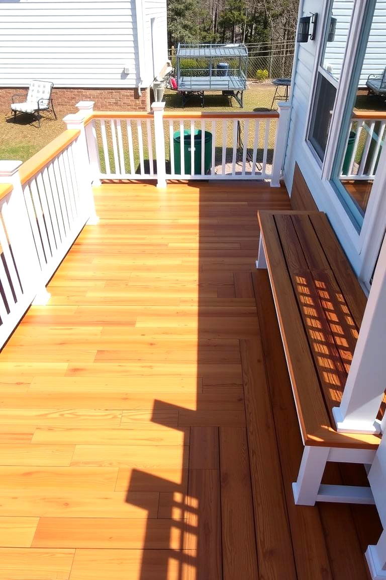
Bringing together the warmth of natural wood with the versatility of paint can result in a stunning two-tone deck. Consider staining the majority of your deck with a natural wood tone and then painting railings, benches, or other built-in features in a complementary or contrasting color. For instance, a cedar-toned deck with crisp white railings offers a classic and refreshing look. This approach allows you to introduce pops of color and personalize your deck design.
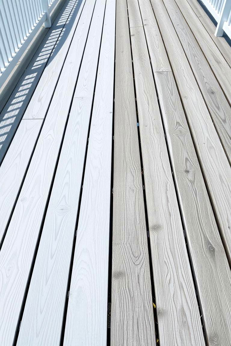
8. Different Shades of the Same Color Family
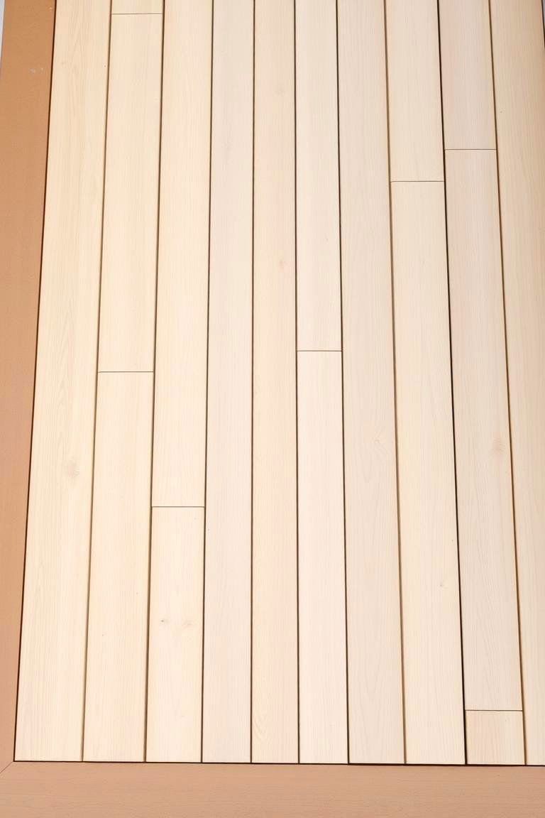
Another subtle yet effective approach is to use two different shades within the same color family. This creates a harmonious and sophisticated look with a gentle contrast. For example, a light beige deck paired with a slightly darker tan border offers a warm and inviting feel. The subtle variation in tone adds depth without being too visually jarring, resulting in a cohesive and elegant outdoor space.
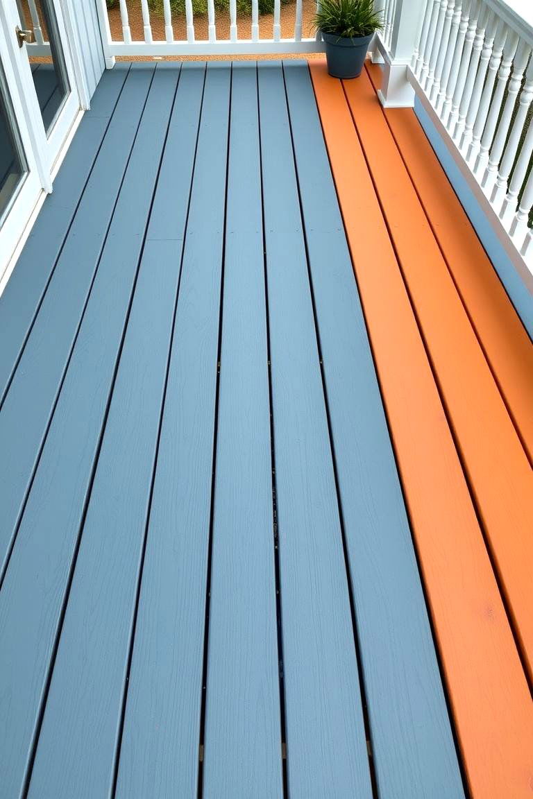
9. Color Blocking for Visual Interest
What about using larger blocks of contrasting colors to define different areas or create a bold visual statement? This technique can be particularly effective on larger decks. Imagine a deck where one half is stained a warm brown and the other half a cool grey, perhaps separated by a built-in planter or seating area. This bold approach adds a contemporary and artistic touch to your outdoor living space.
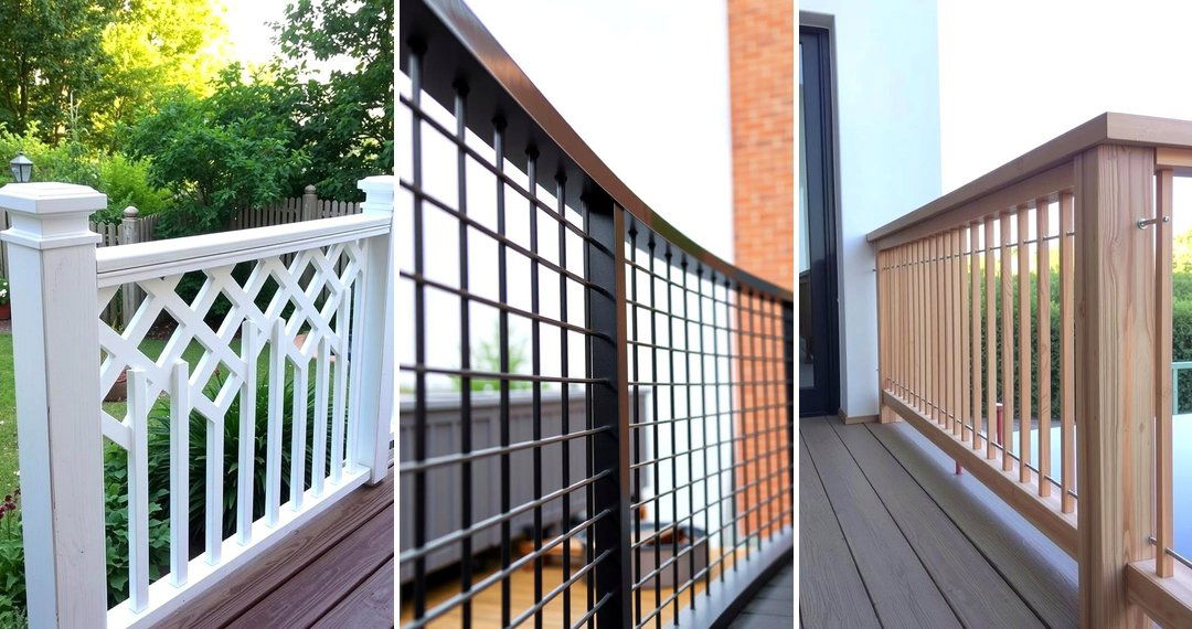
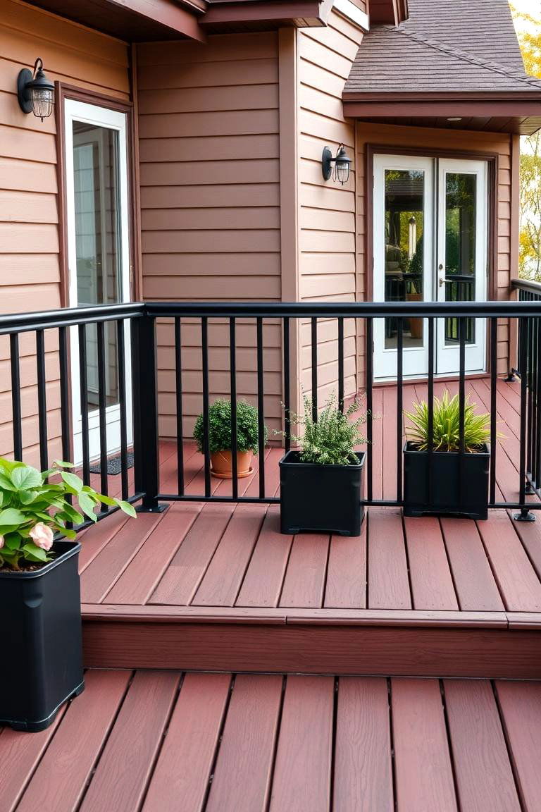
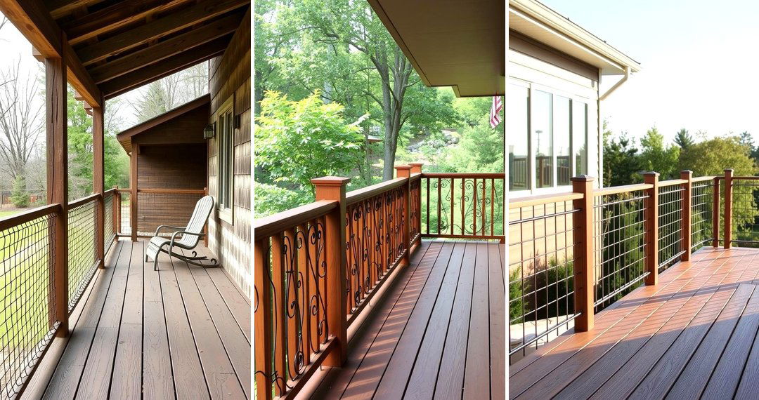
10. Railings as the Contrasting Element
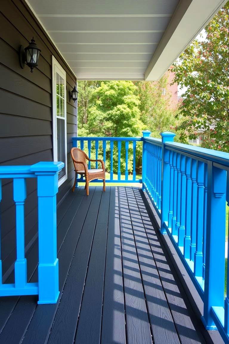
The railings of your deck offer a prime opportunity to introduce a contrasting color. Painting or staining the railings in a shade that complements or contrasts with the deck boards can significantly impact the overall aesthetic. For instance, a dark grey deck with vibrant blue railings can add a playful and modern touch. Alternatively, white railings on a natural wood deck provide a classic and clean appearance. This approach allows you to add personality and visual interest without altering the main deck surface.
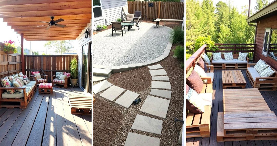
11. Benches and Built-in Seating in Contrast
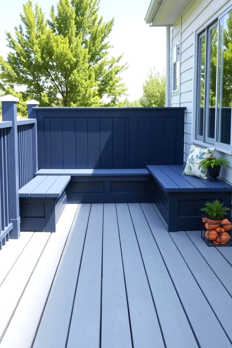
Consider painting or staining built-in benches and seating in a color that contrasts with the main deck. This not only makes these features stand out but also adds an extra layer of visual interest to your outdoor space. Imagine a light grey deck with deep navy blue benches, creating a stylish and inviting seating area. This technique enhances both the functionality and the aesthetic appeal of your deck.
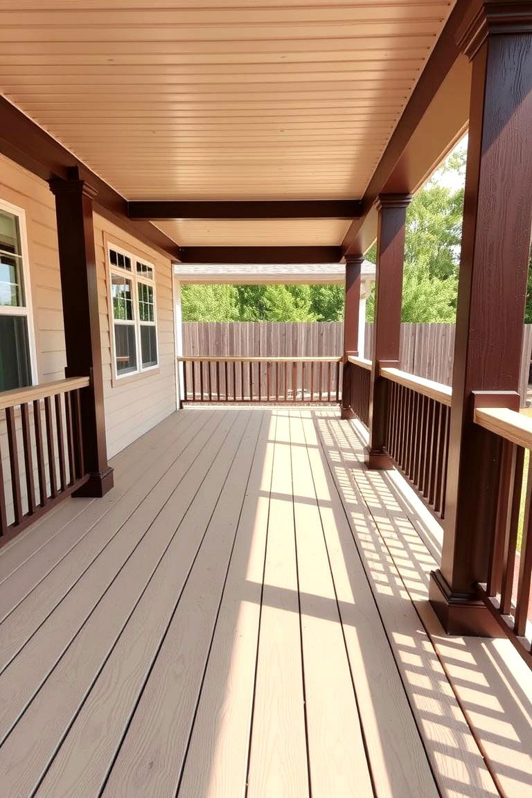
12. Pergola or Overhead Structure with Contrasting Stain
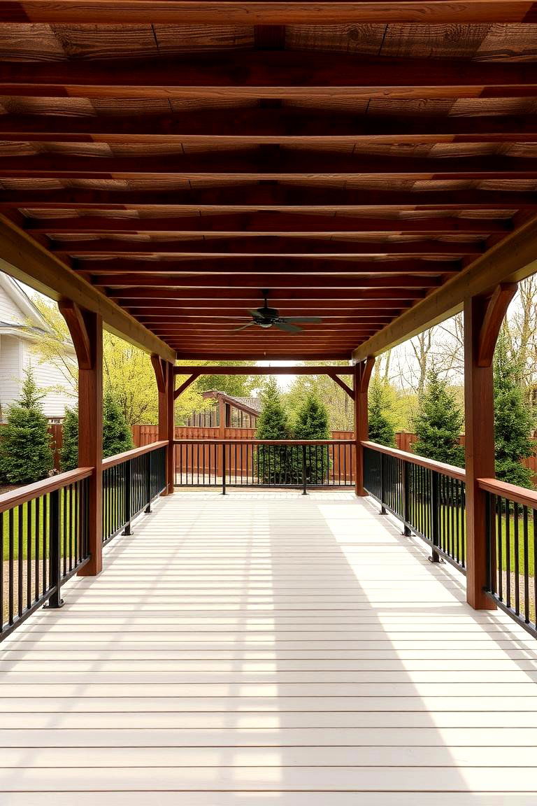
If your deck includes a pergola or other overhead structure, staining it in a contrasting color to the deck itself can create a striking visual impact. For example, a light-colored deck with a dark, rich-toned pergola can add a sense of drama and sophistication. This approach helps to frame the outdoor space and adds architectural interest, making your deck feel like a true outdoor room.
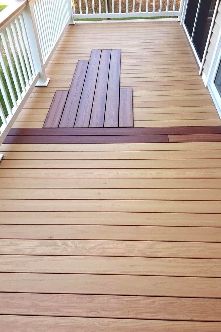
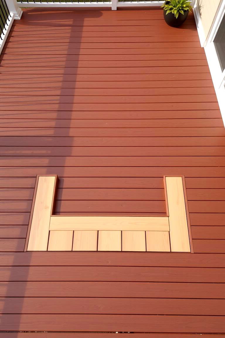
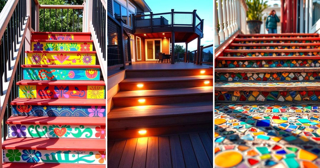
13. Patterned Decking with Two Colors
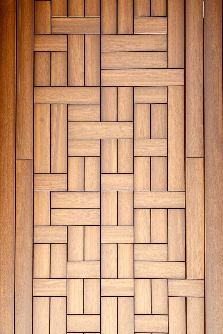
For a more intricate design, consider creating a pattern within the decking itself using two different colors. This could involve stripes, chevrons, or more complex geometric designs. Imagine a deck with alternating light and dark brown boards laid in a herringbone pattern. This technique requires more planning and precision but can result in a truly unique and eye-catching outdoor space.
14. Focus on the Deck Skirting
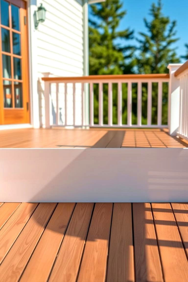
Don't overlook the deck skirting as an opportunity for a contrasting color. Painting or staining the skirting in a shade that differs from the main deck can provide a clean and finished look. For instance, a natural wood deck with a solid white skirting can create a crisp and traditional feel. This often-overlooked detail can significantly enhance the overall appearance of your deck.
15. Incorporating Metal Accents with Color
While not strictly a color scheme in itself, pairing a wood-toned deck with painted metal accents in a contrasting color can create a stylish and industrial-chic vibe. Think of a warm brown deck with black metal railings or planters. The contrast between the natural wood and the sleek metal, enhanced by the paint color, adds a contemporary edge to your outdoor space.
16. Using a Bold Color as an Accent
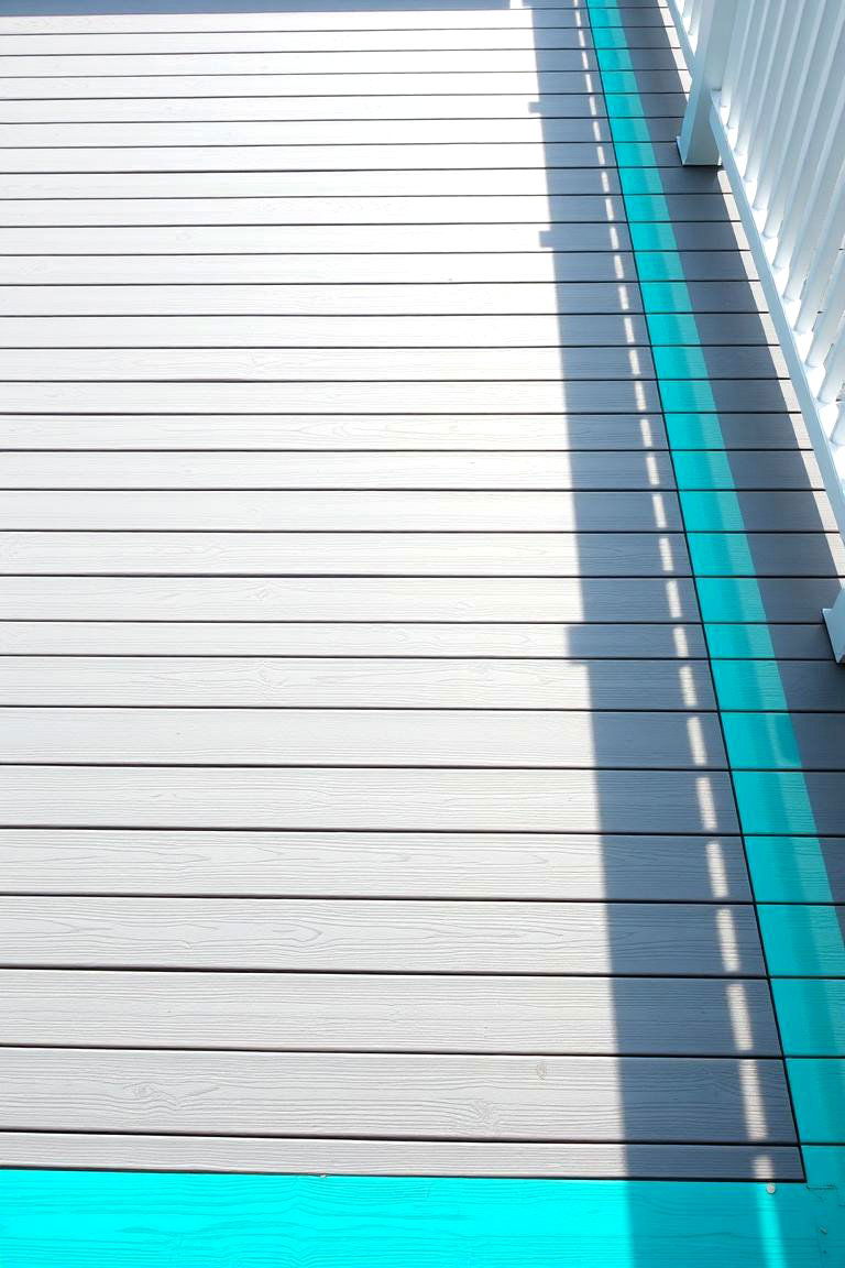
Don't be afraid to introduce a bold and unexpected color as an accent in your two-tone deck scheme. This could be through a painted border, a section of decking, or even through outdoor furniture and accessories that complement the two main deck colors. Imagine a neutral grey deck with a vibrant turquoise border adding a playful pop of color. This approach allows you to inject personality and create a unique focal point.
17. Color Variation Based on Sun Exposure
Consider using different shades of the same color based on the amount of sun exposure different areas of your deck receive. For example, a lighter shade in a sun-drenched area and a slightly darker shade in a more shaded spot can create a subtle and natural-looking variation. This approach not only adds visual interest but can also help to mitigate the effects of fading from prolonged sun exposure.
18. Matching House Trim for Cohesion
To create a seamless transition between your home and your outdoor space, consider using one of the colors from your house trim on your deck. For instance, if your house has white trim, incorporating white railings or accents on your deck can create a cohesive and harmonious look. This approach helps to tie the entire property together aesthetically.
19. Complementary Colors for a Vibrant Look
Explore using complementary colors in your two-tone deck scheme for a more vibrant and dynamic look. Complementary colors are those that sit opposite each other on the color wheel, such as blue and orange or green and red. While a full-on complementary scheme might be too bold, using muted tones of these colors can create an interesting and visually appealing contrast.
20. Monochromatic with Texture Variation
For a sophisticated and subtle two-tone effect, consider using different shades of the same color but with variations in texture. For example, you could have smooth, painted deck boards in one shade and rougher, stained boards in a slightly different shade of the same color. The difference in texture will create a visual contrast even with minimal color variation.
21. Highlighting Architectural Details with Color
If your deck has interesting architectural features, such as posts or beams, consider painting or staining them in a contrasting color to highlight them. This can draw attention to the unique design elements of your deck and add visual interest. Imagine a light beige deck with dark brown support beams, emphasizing the structure and adding a touch of rustic charm.
22. Creating a Faux Rug Effect with Color
Use two different colors of decking to create the illusion of an outdoor rug in a specific area, such as under a dining table or seating arrangement. This can be achieved by framing a section of the deck with a contrasting color. For instance, a light grey deck with a darker grey rectangular section can visually define a seating area and add a touch of coziness.
23. Subtle Gradient Effect with Color
For a unique and modern look, consider creating a subtle gradient effect by using three or four gradually changing shades of the same color across your deck. This could transition from a light shade near the house to a darker shade at the edge. This technique adds depth and visual interest, creating a smooth and sophisticated flow.
24. Personalize with Stencils and Paint
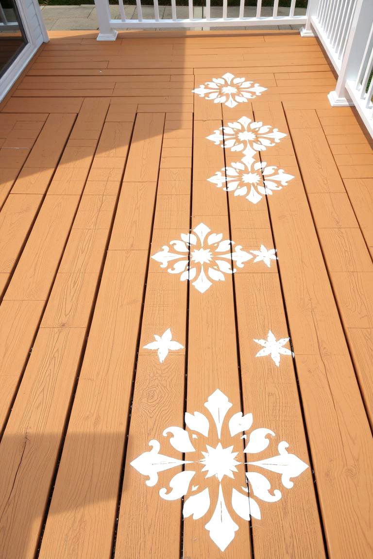
Finally, don't forget the power of stencils and paint to create a truly personalized two-tone deck. You could use stencils to add decorative patterns, borders, or even a faux tile effect to certain areas of your deck using a contrasting color. This allows for maximum creativity and the opportunity to truly make your deck a reflection of your personal style.
Conclusion:
The beauty of 24 Two Tone Deck Color Schemes lies in their versatility and ability to transform an ordinary outdoor space into an extraordinary one. By thoughtfully combining different shades and hues, you can define areas, enhance architectural features, and inject your personal style into your deck design. Whether you opt for bold contrasts or subtle variations, the strategic use of two colors can elevate your deck's aesthetic appeal and create a more engaging and functional outdoor living environment. Exploring these various approaches to two-tone deck color schemes opens up a world of creative possibilities for enhancing your home's exterior.
Related DIY Ideas to Try: